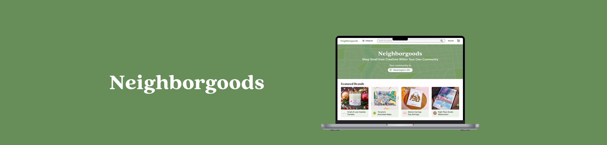
Neighborgoods Case Study
Overview
Solo Project: UX/UI Design
Duration: 3 months, Winter 2024
Tools: Figma, Illustrator
I completed this project under the guidance of my design mentor to further strengthen my UX/UI skills. I thought it’d be fun to create a challenge that combined two of my interests - design and my small business, Abloom! As a full-time visual designer, part-time jewelry maker, and avid supporter of small businesses, I wanted to reimagine an online experience to connect small businesses with a community of shoppers.
Challenge
To create an e-commerce solution that replicates the community-oriented experience of shopping at an in-person market
Goal
Create an app for small businesses to
Highlight their background and story
Connect with shoppers in their community
Have an organized digital storefront
Inspiration
Personal Experience
I’ve seen first-hand all the joys and pains
that come from running a small business
Diversity of Talent
There is so much variety in the handmade crafts space, and passion for each makers brand and products
Challenges in the online space
The special connection of an in-person market experience is lost in the online
space
Research and Ideation
Key Stats
73%
say the option to buy online and pick up in store and home delivery options are more likely to get them to buy from small businesses.
Competitive Research
81%
say the option to buy online and pick up in store and home delivery options are more likely to get them to buy from small businesses.
72%
of Millennials are planning to shop on Small Business Saturday. 69% of Generation Z, 59% of Generation X, and 51% of Baby Boomers.
I narrowed in on three small business e-commerce websites to better understand what users may typically expect from these experiences, and ideate ways I could improve the shopping experience with added features.
DC Shop Small

Shop Where I Live

Etsy


+ landing page clearly communicates mission
+ highlights specific small businesses
+ product categories
- more of a directory, rather than a
shopping experience
+ community centric shopping option
+ recommended seasonal categories
- outdated UI
- information overload
+ leader in their category
+ engaging UI
+ seamless experience
- little no no vetting for makers
- oversaturated with products
- has lost handmade and community
centric feeling

Wireframing
I designed the majority of the screens in low fidelity before jumping into developing a visual style. While laying out this foundation, I noticed how blocky and grid like most of the screens appeared (due to the nature of a product driven site). The format is great for a clear, structured layout - however, I felt like it lacked the energy and artistry I wanted to convey. This takeaway heavily influenced the visual design decisions I made in the next step, since I knew it was necessary to go more creative and bold to add life to the site!
Landing Page
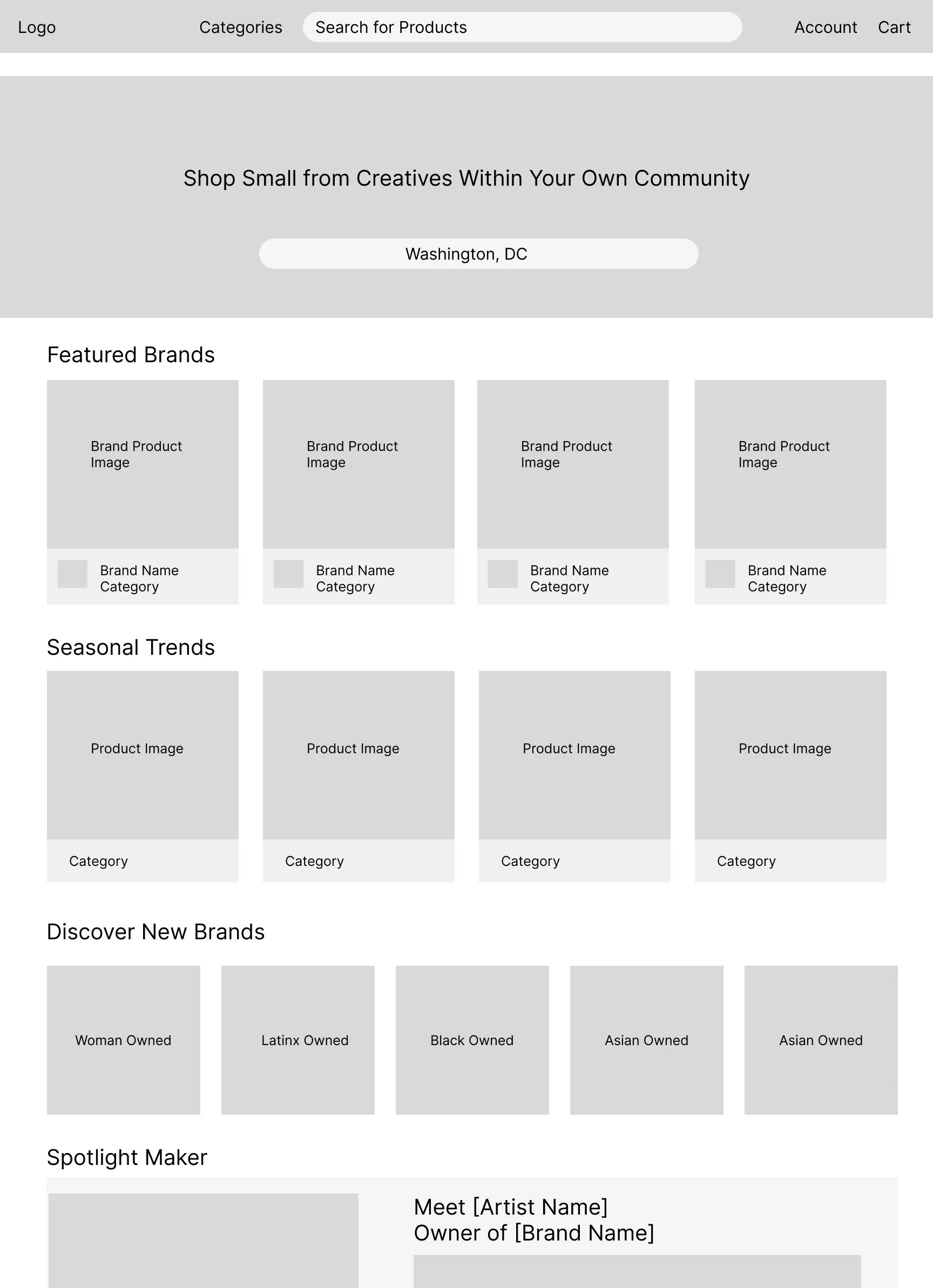
Shop Page

Product Page

Visual Design

High Fidelity Screens
Landing Page

Category Page

Shop Page

Blog Page

Product Page
