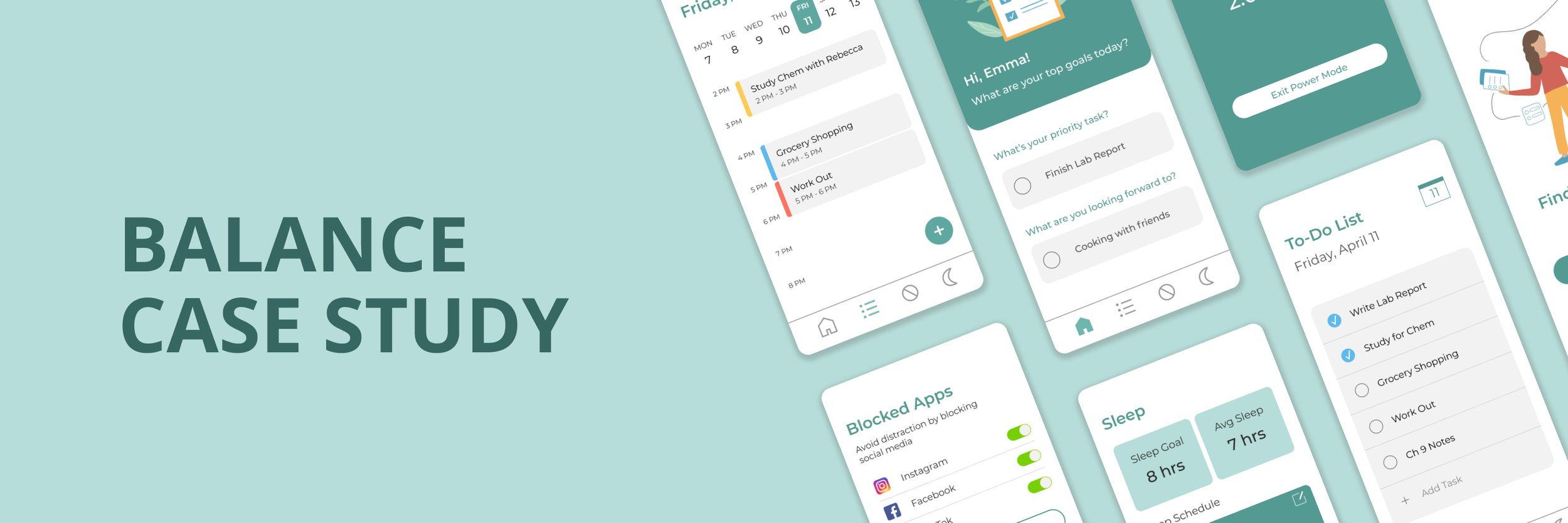
Balance Case Study
As a busy student balancing coursework, extracurriculars internships, and learning new design skills - I understood the struggle of balancing my every day to accomplish all the tasks I set out to do. While trying to develop my UX/UI skills, I completed this self-guided project focused on a very personal topic for me and my peers. Balance is a hypothetical app that helps users stay organized with their everyday and leaves them feeling accomplished.
Solo Project: UX/UI Design
Duration: 2 weeks, Summer 2021
Tools: Figma
Overview
Create an app that helps users stay organized, but avoids making them feel overwhelmed or pressured to always be on the go.
Challenge
Create an app centered around organization, so users can
keep all their to-do items organized
limit distractions to increase focus
feel proud of their accomplishments
Goal
01 Research & Ideation
Understanding Pain Points
My first step was asking my classmates about their experiences balancing all their responsibilities in college.
A few sample questions were:
What are you involved in outside the classroom? Which activities are your priorities?
Do you have a current method of tracking your responsibilities?
Are there any distractions you struggle with?

User Persona

With my understanding of overall needs and challenges, I built a user persona to keep me centered on what the average user may be looking for.
Sitemap
From my understanding of user challenges, I decided on four main features:
Goal Setting
Accomplishing just one goal helps to feel accomplished, even if all to-do items are not done
To-Do List
Due dates and completion time to estimate how to prioritize
Blocked Apps
Limits distractions and tracks productivity
Sleep
Tracks sleep within app to help users think about how it’s affected in the context of their every day life

02 Wireframing

Sketches
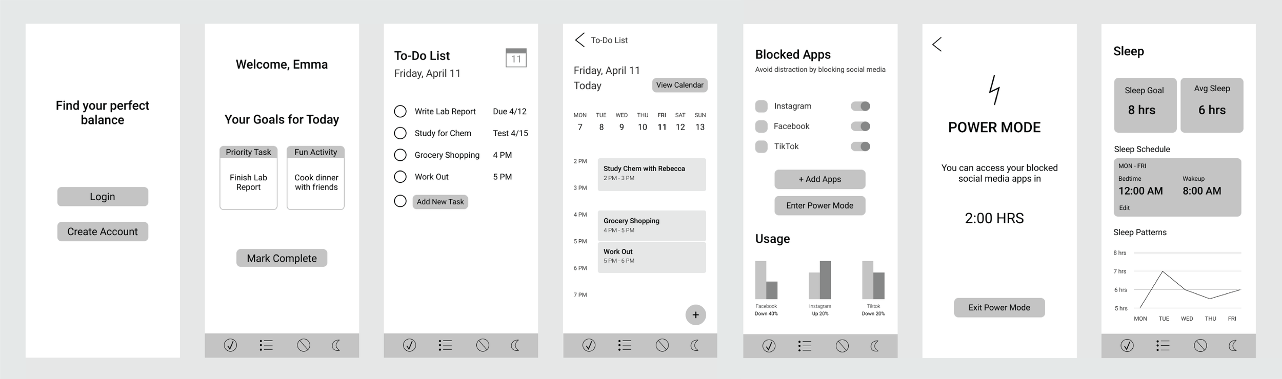
Wireframes
03 High Fidelity
Visual Design
I went with a simple, clean look to keep the emphasis on the information, and not overwhelm content with a distracting visual design. muted shades of green also help create that sense of calm I hope to achieve with users when balancing their every day with ease.
